This is a really dumb topic, I must admit. But, as great as Siglent products are (for the money), who the heck approved the new color scheme? Windows BSOD blue + burnt sienna on a 40% gray background? Yuck.
Really throws off the look of the entire product, in my opinion. Yes, it's a
tool and not a consumer gadget, but jeeeez, those are the colors you thought looked good?
Rant off.
I agree. Good branding and logo is critical to a tech company’s image. Siglent misses the mark somehow.
Of course I think the new one's much better, it certainly catches the eye better so as some might argue, there's no such thing as bad publicity as all publicity is good.
This new logo has been around for a while now and IIRC it came about the time of the first X model releases.

Of course I think the new one's much better, [...]
... and it clearly sends the message that the product has a fan built-in.

Key feature, maybe?
To me it represents a carousel or a merry go round, certainly seems that way.
To me it represents a carousel or a merry go round, certainly seems that way.
I know, I know. I keep asking for an L+ update and they're still working on it.
To be fair the Keysight logo isn’t that great either but Siglent really doesn’t help their own look by putting theirs on that metal coloured sticker. Looks cheap, especially with the corners rounded off on one side only. It looks like the stuck it over a generic brand to hide it or something.
I know, I know. I keep asking for an L+ update and they're still working on it.
I don't think it's your fault!
Maybe it's just me, or maybe it's because there's only been just me! but I think Siglents handling of the CML+ and it's firmware has been ridiculous.
Edit: For about 70% of the 'features', even now I don't know whether it's only me/mine that has them!
Of course I think the new one's much better, [...]
... and it clearly sends the message that the product has a fan built-in.
Key feature, maybe?
Not exactly. It has a fan that rotates counterclockwise.
Of course I think the new one's much better, [...]
... and it clearly sends the message that the product has a fan built-in.
Key feature, maybe?
That may be an abrasive flap wheel they use to take the rust off the edges of their stamped steel framework in the new improved models
Here's some royalty free music for when test gear hits the catwalk

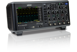
Wow, how would you feel if you ponied up for a LeCroy oscilloscope and then discovered that it was a Siglent!
Wow, how would you feel if you ponied up for a LeCroy oscilloscope and then discovered that it was a Siglent!
Or the other way to look at it; LeCroy model (whatever) and do your homework to find it is a Siglent which you can buy for a much better price !
Wow, how would you feel if you ponied up for a LeCroy oscilloscope and then discovered that it was a Siglent!
Or the other way to look at it; LeCroy model (whatever) and do your homework to find it is a Siglent which you can buy for a much better price !
Does the LeCroy run their own O/S on the Siglent hardware? I don’t come across LeCroy gear in Australia, I don’t think that it’s a big seller in this market.
It makes my head spin. The test gear industry has a lot in common with the car industry it seems when it comes to badge engineering.
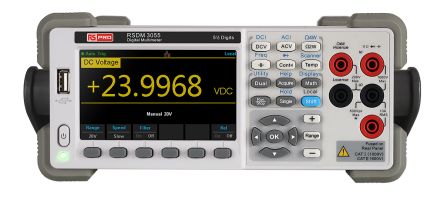
RS Pro is the one that fucks me off as that cheapens even the worst chinese brands

It makes my head spin. The test gear industry has a lot in common with the car industry it seems when it comes to badge engineering.
Yep.
And those are just the better known rebrands.
Some time ago I asked Siglent for a list of their rebranded products and their reply was; if we tell you we'll have to kill you !
Tentacles everywhere !
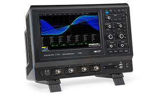
The LeCroy tactical black is kinda cool, but beige is classic. I don't mind the Siglent logo at all; for meaningless marketing symbols, it's as good as any of the others out there. Is there an origin story for the name and logo (other than the coincidental similarity to the Agilent name/logo)?
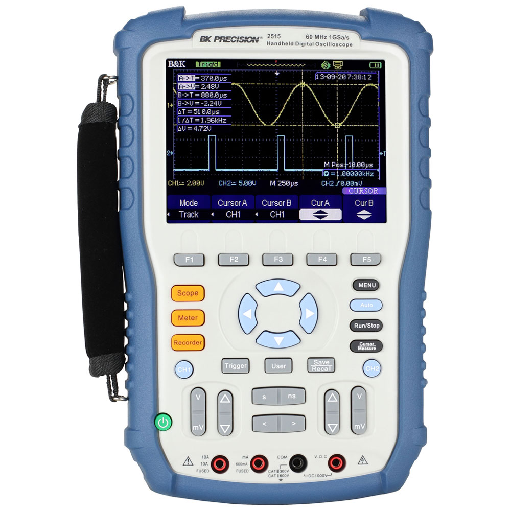
I didn't realize BK rebadged the scope meters. Does that in any way increase the chances that there is going to be a firmware update for them this decade?
The LeCroy tactical black is kinda cool, but beige is classic. I don't mind the Siglent logo at all; for meaningless marketing symbols, it's as good as any of the others out there. Is there an origin story for the name and logo (other than the coincidental similarity to the Agilent name/logo)?
I didn't realize BK rebadged the scope meters. Does that in any way increase the chances that there is going to be a firmware update for them this decade?
Actually, I really mean the logo
colors are ugly. The font and symbol are fine. It's the colors which really throw me off.
If we put aside the familiarity and coziness of a known logo/color/whatever, then the logo itself has no value.
The "glow" and fame of a logo, or brand, is not given by the graphic representation in itself. A good graphic might help, but "the glow" of a brand is forged by the quality of the products or services offered over time.
The name can be any combination of letters and graphic symbols (unless, of course, epic fails like something called 'Pedobear', or so).
What really counts is not the name, or the graphic appearance.
What really counts it's the product, and its quality.
If that truly was the case, then the entire, gigantic, marketing industry wouldn't exist. Companies spend a lot of money on image, which I agree is completely independent of the quality of their products.