-
I'm getting the frequency cut off in the display when viewing on a iPhone X (Thanks to the notch). Otherwise good so far. To be clear it is displaying, something, I just can't make out all of it.
Are you able to take a screenshot?
I think I just answered thiswith the video I posted.
What a pain in the @$$ with file type and size limits to get all these pictures up.
I had to crop a lot of those to the wrong resolution, but it was the only way.
Scott -
I'm getting the frequency cut off in the display when viewing on a iPhone X (Thanks to the notch). Otherwise good so far. To be clear it is displaying, something, I just can't make out all of it.
Are you able to take a screenshot?
I think I just answered thiswith the video I posted.
What a pain in the @$$ with file type and size limits to get all these pictures up.
I had to crop a lot of those to the wrong resolution, but it was the only way.
Scott
Annoyingly I do need the screen shot in the native resolution. If you use something like flickr or a image hosting service i'll be able to get the files. You can also email them to me at eev.davidledger@gmail.com -
I’ll zip them and email them. I did keep the original native shots just in case.
Since native shots on the iPad Pro can be 5mg for one screen shot and different emails servers also have size limits I may just share a link to my network storage, or drop box that you can download them from.
I’ll PM the download link to you. Even some photos storage sites change the resultion of pictures sometimes.
Scott
Edit: just remember the iPhone X screen shots is not what we see when using the app. -
I’ll zip them and email them. I did keep the original native shots just in case.
Since native shots on the iPad Pro can be 5mg for one screen shot and different emails servers also have size limits I may just share a link to my network storage, or drop box that you can download them from.
I’ll PM the download link to you. Even some photos storage sites change the resultion of pictures sometimes.
Scott
Edit: just remember the iPhone X screen shots is not what we see when using the app.
Yeah DropBox or whatever is fine Thankyou!
-
I think the way to do this is to have a partial grid division on the right hand side of the time axis.
Something like this?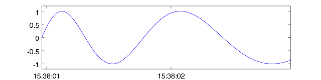
(Obviously it'd move a lot more smoothly and slowly in reality.)
Incidentally, I think it's also important to have an option to display relative vs absolute times. I'm sure there are people out there who are interested in actual absolute timestamps (e.g. Sep 15th, 4:30pm), but most of the time I'm just running a test so I just want (t=0s, t=4.5s), etc. Code that supports both (and the code that generated the animations above) is below. Obviously Octave/MATLAB code isn't directly useful; but it should be easy to translate/adapt.Code: [Select]function setup_x_axis(xmin, xsize)
% Set axes limits of the plot
axis([0 xsize -1.2 1.2])
% Choose most readable time units
if (xsize < 100)
label = 'time (seconds)';
divider = 1;
dateformat = 'HH:MM:SS';
elseif (xsize < 100 * 60)
label = 'time (minutes)';
divider = 60;
dateformat = 'HH:MM';
elseif (xsize < 60 * 60 * 40)
label = 'time (hours)';
divider = 60 * 60;
dateformat = 'HH:MM';
else
label = 'time (days)';
divider = 60 * 60 * 24;
dateformat = 'dd-mmm HH:MM';
endif
xsize = xsize / divider;
% Choose most readable x tick spacing
best_step_size = 1;
for candidate = [0.1 0.2 0.5 1 2 5 10 20 50 100]
if candidate*2 > xsize
break
endif
best_step_size = candidate;
endfor
% Place x ticks
xticks = 0:best_step_size:xsize;
% Format x tick labels
xticklabels = char([]);
if xmin
xlabel('');
% Nudge the x ticks to nice round times/dates
adjustment = ceil(xmin / (best_step_size * divider / 86400)) * (best_step_size * divider / 86400) - xmin;
xticks = xticks + adjustment / (divider/86400);
for xtick = xticks
xticklabels = [xticklabels; datestr(xmin + xtick*divider/86400, dateformat)];
endfor
else
xlabel(label, 'fontsize', 14 );
for xtick = xticks
xticklabels = [xticklabels; num2str(xtick)];
endfor
endif
% Apply to the plot
set(gca, 'xtick', xticks * divider);
set(gca, 'xticklabel', xticklabels);
endfunction
u = 0:0.01:200;
t = 1.1 .^ u - 1;
x = t;
y = sin(t);
plot(x, y);
recorded = 2;
start_duration = 2; %0.5;
end_duration = 300000;
frame_count = 240 - 25;
durations = logspace(log10(start_duration), log10(end_duration), frame_count);
for indexx = 1:numel(durations)
setup_x_axis(730736.6514, durations(indexx));
set(gca, 'fontsize', 14)
drawnow
print(num2str(indexx, 'frames/grame%04d.png'), '-S640,160')
endfor -
Alright, I don't know who reported this error but it is resolved with another firmware update.
Pre-1.22 firmware the main value was sent to the app via a 16 bit unsigned value.
In frequency measurement on the multimeter it was possible to display 99.993 xHz.
The 16 bits that were allocated in the packet for the 50000 count multimeter wasn't sufficient as 16 bits can represent a maximum of 65535. To resolve this the packet format was revised in a backward compatible way. I.e. future versions of the App will work with old versions of firmware (except for this error condition).
We added 2 extra bits to the packet we can now display 99.999 kHz if needed. This fix will be included in Build 1.4. This fix has been tested and confirmed functional. -
I think the way to do this is to have a partial grid division on the right hand side of the time axis.
Something like this?
(Obviously it'd move a lot more smoothly and slowly in reality.)
Incidentally, I think it's also important to have an option to display relative vs absolute times. I'm sure there are people out there who are interested in actual absolute timestamps (e.g. Sep 15th, 4:30pm), but most of the time I'm just running a test so I just want (t=0s, t=4.5s), etc. Code that supports both (and the code that generated the animations above) is below. Obviously Octave/MATLAB code isn't directly useful; but it should be easy to translate/adapt.Code: [Select]function setup_x_axis(xmin, xsize)
% Set axes limits of the plot
axis([0 xsize -1.2 1.2])
% Choose most readable time units
if (xsize < 100)
label = 'time (seconds)';
divider = 1;
dateformat = 'HH:MM:SS';
elseif (xsize < 100 * 60)
label = 'time (minutes)';
divider = 60;
dateformat = 'HH:MM';
elseif (xsize < 60 * 60 * 40)
label = 'time (hours)';
divider = 60 * 60;
dateformat = 'HH:MM';
else
label = 'time (days)';
divider = 60 * 60 * 24;
dateformat = 'dd-mmm HH:MM';
endif
xsize = xsize / divider;
% Choose most readable x tick spacing
best_step_size = 1;
for candidate = [0.1 0.2 0.5 1 2 5 10 20 50 100]
if candidate*2 > xsize
break
endif
best_step_size = candidate;
endfor
% Place x ticks
xticks = 0:best_step_size:xsize;
% Format x tick labels
xticklabels = char([]);
if xmin
xlabel('');
% Nudge the x ticks to nice round times/dates
adjustment = ceil(xmin / (best_step_size * divider / 86400)) * (best_step_size * divider / 86400) - xmin;
xticks = xticks + adjustment / (divider/86400);
for xtick = xticks
xticklabels = [xticklabels; datestr(xmin + xtick*divider/86400, dateformat)];
endfor
else
xlabel(label, 'fontsize', 14 );
for xtick = xticks
xticklabels = [xticklabels; num2str(xtick)];
endfor
endif
% Apply to the plot
set(gca, 'xtick', xticks * divider);
set(gca, 'xticklabel', xticklabels);
endfunction
t = 0:0.01:200;
x = 1.1 .^ t - 1;
y = sin(t);
plot(x, y);
recorded = 2;
start_duration = 2; %0.5;
end_duration = 300000;
frame_count = 240 - 25;
durations = logspace(log10(start_duration), log10(end_duration), frame_count);
for indexx = 1:numel(durations)
setup_x_axis(730736.6514, durations(indexx));
set(gca, 'fontsize', 14)
drawnow
print(num2str(indexx, 'frames/grame%04d.png'), '-S640,160')
endfor
Yes that looks good, but I don't think log scale works well with pinch to zoom, would have to be linear, otherwise zooming into the the start of a large data set would be horrid. -
Yes that looks good, but I don't think log scale works well with pinch to zoom, would have to be linear, otherwise zooming into the the start of a large data set would be horrid.
 Where is a log scale mentioned anywhere? The only thing that is log is the animation I did (to show a few seconds and a few days in a single animation consistently), but that has nothing to do with the implementation of the axes ticks and in-app behaviour.
-
Yes that looks good, but I don't think log scale works well with pinch to zoom, would have to be linear, otherwise zooming into the the start of a large data set would be horrid.
Where is a log scale mentioned anywhere? The only thing that is log is the animation I did (to show a few seconds and a few days in a single animation consistently), but that has nothing to do with the implementation of the axes ticks and in-app behaviour.
t = 0:0.01:200;
y = sin(t);
^
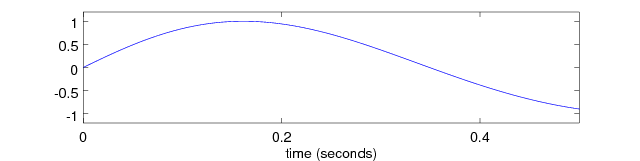
That is a linearly sampled function, the plot displays a log scaled function.
The function linearly scaled should look like the attached:
-
Yes that looks good, but I don't think log scale works well with pinch to zoom, would have to be linear, otherwise zooming into the the start of a large data set would be horrid.
Where is a log scale mentioned anywhere? The only thing that is log is the animation I did (to show a few seconds and a few days in a single animation consistently), but that has nothing to do with the implementation of the axes ticks and in-app behaviour.
t = 0:0.01:200;
y = sin(t);
^
That is a linearly sampled function, the plot displays a log scaled function.
The function linearly scaled should look like the attached:
Nono, ignore that. That's just to make the blue curve in the plot look interesting when scaled hugely. Don't look at the blue curve at all if it's confusing you; the behaviour of the tick marks on the axis (which clearly aren't a log scale) is what's actually being demonstrated here. x is time (in seconds), y is voltage. Sorry, didn't expect people to be inspecting that part of the code.
I can modify the code to just have a normal linear sin wave if you want; but again that's nothing to do with the axis behaviour. It'd just look a bit silly because the plot would just be a solid blue block for most of the demonstration. -
Yes that looks good, but I don't think log scale works well with pinch to zoom, would have to be linear, otherwise zooming into the the start of a large data set would be horrid.
Where is a log scale mentioned anywhere? The only thing that is log is the animation I did (to show a few seconds and a few days in a single animation consistently), but that has nothing to do with the implementation of the axes ticks and in-app behaviour.
t = 0:0.01:200;
y = sin(t);
^
That is a linearly sampled function, the plot displays a log scaled function.
The function linearly scaled should look like the attached:
Nono, ignore that. That's just to make the blue curve in the plot look interesting when scaled hugely. Don't look at the blue curve at all if it's confusing you; the behaviour of the tick marks on the axis (which clearly aren't a log scale) is what's actually being demonstrated here. x is time (in seconds), y is voltage. Sorry, didn't expect people to be inspecting that part of the code.
No worries, thanks for the code it will help. But it will be a few versions before this makes it into the App. -
No worries, thanks for the code it will help. But it will be a few versions before this makes it into the App.
Awww...
Can I report multimeter issues in the mean time?
-
Build 1.4:
1. Resolved issue where pinch can zoom into infinity (when axis disappeared that’s what happened)
2. Changed button colours so that the buttons are more visible to avoid confusion where buttons are (didn't shrink buttons as that section will be used for future buttons)
3. Added support for numbers above 65535 in the Bluetooth packet (you will need firmware 1.22) the packet now has 18 bits for the value.
4. Added graph support for Fahrenheit
5. Added build version in settings screen
6. Added description on settings screen
7. Removed devices that are already connected from settings screen
8. Data is now drawn below graph labels
9. Added 121GW label to the tabs next to the serial number (so it isn't just [ 0 ])
10. Resolved scaling issue with splash screen
11. Reset also now resets zoom and data, not just data (It didn’t before)
Planned changes for 1.5:
1. Remove notch region from app, it will put a black bar there. I will not make use of this space as the app needs to be compatible with other platforms. <- Done
2. Improve scaling of tab titles
3. Improve scaling of and button labels <- Done
4. Merge Bluetooth reconnect fix with version 1.4 <- Done
Planned changes for 1.6:
1. Further fixes
Planned changes for 1.7:
1. Rescaling x axis lines with round numbers
Known Issues:
- Bluetooth reconnect will close App, temporary situation haven't merged fix in this build
Newest firmware can be downloaded from https://www.eevblog.com/product/121gw/
Avaliable NOW! -
Build 1.4:
...
3. Added support for numbers above 65535 in the Bluetooth packet (you will need firmware 1.22) the packet now has 18 bits for the value.
...
Newest firmware can be downloaded from https://www.eevblog.com/product/121gw/
Avaliable NOW!
thanks,
So a V2 of '121GW-BLE-Packet-Format-V1.pdf' can be expected? -
Build 1.4:
...
3. Added support for numbers above 65535 in the Bluetooth packet (you will need firmware 1.22) the packet now has 18 bits for the value.
...
Newest firmware can be downloaded from https://www.eevblog.com/product/121gw/
Avaliable NOW!
thanks,
So a V2 of '121GW-BLE-Packet-Format-V1.pdf' can be expected?
Absolutely, but not much has changed, only the don't care bits have been used (they display as 0 in the document, should be X). -
Build 1.5:
1. Remove notch region from app, it will put a black bar there. I will not make use of this space as the app needs to be compatible with other platforms.
2. Improve scaling of and button labels
3. Merge Bluetooth reconnect fix with version 1.4
Avaliable NOW! -
wow that was quick I just started playing with 1.4... lol
-
Build 1.5:
2. Improve scaling of and button labels

I like the new buttons. Could these be made available in landscape view as well? -
Build 1.5:
2. Improve scaling of and button labels
I like the new buttons. Could these be made available in landscape view as well?
What do you mean?
The buttons should currently be available in Landscape? -
Build 1.5:
2. Improve scaling of and button labels
I like the new buttons. Could these be made available in landscape view as well?
What do you mean?
The buttons should currently be available in Landscape?
Hold, Mode, Rel and Range buttons are not visible in Landscape on both my iPad Mini and iPhone 5s. -
Build 1.5:
2. Improve scaling of and button labels
I like the new buttons. Could these be made available in landscape view as well?
What do you mean?
The buttons should currently be available in Landscape?
Hold, Mode, Rel and Range buttons are not visible in Landscape on both my iPad Mini and iPhone 5s.
Oh those buttons.
It does kinda screw up the display a little.
This will have to wait until I lock the aspect ratio of the multimeter screen rendering. -
I was just about to report a bug in 1.4, now I have to try it again on 1.5, lol
I’ll let you know.
Scott -
Never mind, looks like it was fixed in 1.5. The bug I was talking about was loosing Bluetooth connection, and when the device gets back in range and the app try’s to re-connect again it would crash. It was relatable, but I just tested again with 1.5 and it seems to work fine now.
I was even able to switch between 4 devices just by walking some out of range. 20 times in and out of the garage I’m getting dizzy.
I checked accrosed the iPod touch, IPad Pro, iPhone 6S, IPad mini 2 and iPhone X, looking good.
iPhone X looks a lot better now also :-)
I don’t allow apps to run in the background, so I found it odd even if the app was closed (minimized/background) it kept the connection. This might not be anything you can change in the app since it’s the Bluetooth that’s keeping the connection. So it might be more of an iOS vs Bluetooth conflict and background app refresh won’t matter in this case. But it was funny to walk one device out of range and watch the other device pick it up. I’m sure that would cause blanks in the logging, and both logs would need to be combined from both devices to see the full story. But I just did this to see how it would handle that situation.
Another random idea for you, you can ignore it or put it on the list of future ideas. I know I’ve thrown a lot at you already. They are just suggestions.
Is it possable to put a little dot in the corner or a Bluetooth icon that changes green for connected, and red for connection lost? Sort of like my mobile gimbals have, a Bluetooth connection status icon. The gimbals change the icon but I find that not to be as visible and usually miss it when it changes. That why I suggested changing the color of the icon between green for good, and red for bad lost connection.
It’s looking good, I’ll do more complete testing after a night of rest.
Thanks for the hard work on this,
Scott
BLE is abit strange in that its not always clear when a connection is still there. No pairing is required with the App, I can however do a timer based system (no data in X seconds), not exactly what was requested though. -
That’s not a bad idea, sort of like over lmit. So when no data is being received to plot out it will show some message, just something to let people know they lost connection for one reason or another.
Like I said, it was just a random thought.