Looks nice!
In the past, I was unable to see/click the video links, and now I can!
Thanks. It's now up and running.
Still working through a bunch of things, and it will be slowly tweaked over the coming weeks, no not finished yet, but operational.
Please report any bugs.
Congratulations on the new site! Looking good

The videos cover the menu or more specifically the Blog submenu as is it the only large one.
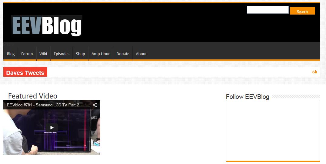
Don't like 'Daves Tweets': To start with the missing apostrophe is very annoying, it just displays one tweet, there appears to be a two lines of text overlap problem with at least one of the tweets and clicking on a tweet brings up a 404 error.
Otherwise it looks good so far, the layout could be made wider, lots of free space on wide screen monitors.
It's such a vast improvement over the old one, that I won't even bother to nit-pic small details! Thanks for the updated look/feel.

The videos cover the menu or more specifically the Blog submenu as is it the only large one.
I don't see that. The Blog submenu works just fine for me.
The videos cover the menu or more specifically the Blog submenu as is it the only large one.
I don't see that. The Blog submenu works just fine for me.
I just re checked it. It only happens on Internet Explorer, Chrome is fine. There is also a scaling difference between the two browsers.
The videos cover the menu or more specifically the Blog submenu as is it the only large one.
I don't see that. The Blog submenu works just fine for me.
I just re checked it. It only happens on Internet Explorer, Chrome is fine. There is also a scaling difference between the two browsers.
Works fine on my ie. What version are you using?
Works fine on my ie. What version are you using?
Version 11. Try putting your mouse on the on the Blog menu option.
IE vs Chrome, find the differences...

Is it just me, or does the new small favicon look a little bit ... "vaginal" ?

I can't unsee it now. Sorry
Just to add some slightly more useful feedback ...
Maybe I'm just used to how it was before, but the orange feels weird. I guess part of the problem with that is there's still blue in the EEVBlog logo at the top, which doesn't really fit with the orange.
It's already been mentioned, but the lack of apostrophe in "Dave's Tweets" is driving me nuts.
To actually click on a tweet and get to it on twitter, you have to click on the date on the right. It would be better if you could click anywhere in that whole area to go to the currently displayed tweet.
Are tweets really so important that they have to be displayed on the top of all other content, in a box that makes it look like the most important thing on the whole page? It seems to me that it would be better to put them with the stuff on the right above links.
Just experimented with the EEVBlog logo and made the EEV part orange.
At the very least remove the square from the image with mismatched background color.


Again though, details details details. I like the new site very much!
Report on the new website:
1) The site is painfully slow to load and until it completely loads scrolling down is very slow (this is with a 100 Mbs cable connection)
2) I sometimes see one line written over another in the 'Daves Tweets' section.
3) No other layout or rendering bugs seen and once the page loads everything appears to work.
Browser string is Mozilla/5.0 (X11; Ubuntu; Linux x86_64; rv:40.0) Gecko/20100101 Firefox/40.0
Well here comes the "fix this" brigade.
Kind of reminds me of the joke about asking a room of 100 engineers how to do something. Your going to get 100 ways to do it.
looks good here, can tell they are PROfessionals

Looks good on mobile but the 'request desktop site' in chrome doesn't work
1) The site is painfully slow to load and until it completely loads scrolling down is very slow (this is with a 100 Mbs cable connection)
this garbage theme uses 36 separate .js files (34 listed + youtube and imgur or something =36 total)edit: its less than that, somehow they managed to include some of them repeatedly three times over, so its ~26 .js files + 14 .css files
that means >40 three way handshakes before it can start to render
Dave was taken for a ride by script kiddies
Dave was taken for a ride by script kiddies
Can you try and not be such a dick next time?
No one should expect the site to be perfect. We all know how releases are right?
My computers, tablets and phones - at home and at work, all load the site pretty quickly. The DOM starts rendering within a second and other than the async loading of thumbnails and the like the render is so quick that I don't notice it.
If the site is slow then I guess you're using a browser with a slow JS interpreter, or a very slow internet connection.
Rasz, every javascript that's included within the <body> will load after the DOM starts to render.
The site was just deployed. I would not care about things like optimize requests immediately either. Maybe they will in a few days, maybe not. Who cares?
If Dave wants to optimize requests then I'm sure the developers can configure a minifier for him, if not I'd do it for free.
I've taken out a few superfluous wordpress plugins that is baggage over the years, so might work quicker now.
According to a plugin performance profiler I ran, PodPress is the plugin that takes by far the most time.
Looks good on desktop, though it does have a few bugs, for example:

This "about" link is obscured by a (totally useless, wtf, I have scrollbars and a home button!) "jump to top" button. I can't click it.
Mobile, on the other hand, is a shit show. It seems to be unusable on almost every mobile browser, and I'm not the only one who has found this, it's the general consensus in your IRC channel right now. Get the iNerds to test that out more, and on more than just their iPhones.
I guess i will never visit the Home page again. If same change will come to the Forum i will be left no options but unsubscribe.